Tuesday, 30 June 2015

B for Boy Double Strap Watch

I'm back with my Boy London collection today with a relatively simple design watch.

This watch is from the B for Boy collection by Boy London. The B for Boy watches seem to have the same design style as the main Boy London brand, but tend to be smaller watches, so the name would suggest they are aimed at younger people.

The Boy London brand appeared in 1976 and became very popular in the London club/fashion scene. The true Boy London brand took a break over the 90s, but watches continued to be made under that name from at least the mid-90s, and so my working assumption is that they came from a manufacturer who had bought the rights.

This particular model has the same design case as the B for Boy Wheel watch I blogged in May. It is a small round design with the B for Boy name being used for the hour markers from 12 to 4, and a combination of numbers (6 and 9), stars, the moon, the sun, and a crown for the rest. The face design is plain with just the Boy London name in white on a black background. The back states the watch is B for Boy by Boy London, and has the stickman logo, and this watch has a Boy London hologram sticker too. The watch itself is a 3 hand dial design, and the front of the watch says it has a Japanese movement (which is likely Miyota).

The strap has a Boy London button with Union Jack logo in the middle and a Boy buckle. The unusual thing with the strap I that there is an extra section with a second Boy buckle, giving the watch a double strap.

I haven't found any new information on dates for the B for Boy watches, so I don't have any reason to think my guess last time as early 2000s would be wrong.

Monday, 29 June 2015

Fossil Big Tic Chinese Lunar Dragon JR 7997

Today's watch is one of the more recognisable watch lines, and one which has been copied by many different manufacturers.

As the watch has an analogue dial with a full face LCD for the seconds, many watch fans would be right in spotting this is a Fossil Big Tic.

The Big Tic design has come in many different variations over the years, and this model is one of the Japanese inspired designs. The first detail is the use of the Japanese writing language Kanji for the numbers on the hour markers around the edge of the dial (except for number 6 where the Fossil name sits). The seconds display also uses Kanji characters on an inverse style LCD. The dial is a 2 hand design with a quartz movement. The two hands are both lightly curved triangles, and are glow in the dark for nighttime use.

The case is a curved brushed stainless steel design, which curves into the matching steel strap. The glass is round, and has a Chinese Dragon etched into the back covering the whole width of the face.

The back is dominated by a large Big Tic logo with the other details around the outside. Just below the logo is the serial number and the model number, which is JR 7997. The other information reveals this is stainless steel with a 50m /165ft water resistance.

The back also shows the watch is covered by two US patents 6,084,828 and 6,147,933. Both patents cover a "Timepiece and chronometer with overlapping, separately driven analog and digital displays" and were filed in 1999 (after a 1998 Chinese patent).

This model isn't for sale anymore, but originally had a price of around $65.

Friday, 26 June 2015

Module GV9121

Today's watch has a design which seems really popular as this is the 3rd different brand with an almost identical design.

This watch is by the Module brand which has featured a few times before on this blog. The brand is made by a company called Poll Position Ltd Co, who seem to be a watch distributor (and manufacturer?) in Japan.

The watch is a rotating disc model with a left side display, and the brand logo on the right. The face only seems to be a thin horizontal rectangle as the strap is connected on the front of the case, hiding most of the case behind it.

I've blogged this exact design from two other brands which I collect. The Deadman GV 5766 seems to be the earliest of them with this design (as I've confirmed the brand existing in the late 90s), and also have a model by Deep called the 5766 NW. This model by Module doesn't share the same 5766 number as the others, and is a GV 9121. I've had the suspicion that these brands are linked in some way, for example being from the same overall owner, or branding watches from a 3rd party supplier. This watch keeps up that suspicion, but the face that it has a Deadman style model number (GV xxxx), but a different number is a little confusing.

I know that Module and Poll Position Ltd Co are still around, so I think this is a new model, and I'd guess early 10s.

Thursday, 25 June 2015

United Colors of Benetton Square Bracelet Watch

It's been a while since I wore a really unusual looking watch, so today I've decided on one which is pretty unique (especially as I'm going to an art gallery opening tonight too).

The watch is another in the range by United Colors of Benetton, but not in the Benetton by Bulova range. I've featured many watches from Benetton so far, and this is the most unusual of the lot. More info about the brand can be found in my other posts.

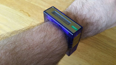
The first thing you notice about the watch is that it is square - not that the face is square, but the whole watch including the strap is a square bracelet design (with a round hole for your wrist). It is made from semi transparent blue non-flexible plastic, which is hinged at one side for opening so you can get it on. The other opening side has a metal hook which when pressed releases the two halves.

The face of the watch is mirrored with a window for the LCD display. The LCD is a long thin dot matrix array of around 35x7 which shows a scrolling message (United Colors of Benetton) as well as the time. To excentuate the difference between message and time, the message is in normal LCD display while the time is shown in inverse. There is a mode button on the side of the watch which allows you to bring up the time instantly or to show the date. The other button on the side is for time setting mode, which works after you use the mode button to select time or date. Also in the setting mode is the option to change the language for the date to one of a variety of European languages, including English, French, German, Italian, and Spanish. Next to the display is a small United Colors of Benetton logo in white and green.

The back of the watch part is fastened with screws, and just has the basic info (brand name, stainless steel back, 3atm water resistant, and registered design).

I've not seen this online, so have no formal confirmation of the date of the watch, but the LCD module date starts at 2005, so my assumption is that the watch was released around this date. I do have the original price label, so I know it was sold with an rrp of €50.

Wednesday, 24 June 2015

Neff Daily Wild NF0208 Lime

Today is my second from the Neff watch brand, and has a nice unusual design.

The Neff brand started in 2002 with the name Neff Headwear, initially specialising in skate and surf wear, before starting the Neff Vision eyewear and Neff Time watches.

This model is part of a range called Daily Wild, which has the model number NF0208. The Daily Wild watches are all 2 hand dial analogue watches with a large plastic case and thick silicone or rubber strap. The watches come in all manner of different designs, but all of them have the same model number.

This design is called Lime, an at first glance looks like it is only a 1 hand watch. The artwork which seems to be on the face of the watch is actually a disc which represents the hour hand, and has caused a few people to need a while to spot what time it is. The hours disc is slightly transparent, so you can see hour markers through the yellow part, but there is a clear window with a pointer which indicates which hour it is. The strap follows the same colour scheme as the face and is in lime green, yellow, and white, with a Neff branded black buckle.

The watch back has the word Daily in large letters as well as the Neff round face logo, along with some basic information. For materials, it says that the back is ABS reinforced stainless steel, and that the case is 5atm water resistant. It also shows that inside, the quartz movement is from Singapore, which you don't see that often.

This design isn't for sale anymore, so I think it is an older design (late 00s, or early 10s), but the others for sale are around $35, so I'd guess the same rrp for this watch.

Tuesday, 23 June 2015

FHB Classic F-504

Today's watch is from a new brand to this blog, and a brand which has been a little weird to research.

The watch is by a brand called FHB which stands for Felix Huber Basel. Felix Huber is a known name in the Swiss watch world, having worked at the Catena and Zeno Watch companies. In 1973 Felix Huber bought the rights to the Zeno name and ran the company. According to the FHB website, it was in the 60s that the FHB name was started, watches were designed, but it seems never released (as it wasn't deemed the right time for a small Swiss workshop to get into electronic watches). In 1995, the Felix Huber designs were rediscovered and the FHB brand was reborn. The strange part about this history is that it was written in Japanese. Even though the company is counted as being Swiss (and the watch states Swiss made on the back), the official FHB website is entirely in Japanese. I guess this means that the watches were re-released mainly for the Japanese market, and not many of the watches are seen on English language sites.

This particular model is called the F-504. The F504 is one of the standard designs from FHB, and was originally designed in May 1978 (with the face stating D Code Mai 78). It is a 3 hand dial design with date window and a round case. The bezel rotates and features different cities /time zones for calculating world time. The case is a mixture of steel and plastic, with a water resistance of 3atm. The face, back, and clip for the strap shows the FHB Classic logo which is the letters FHB with an elongated top line to the F with a lightning style underline which also crosses the word classic which is in a script font. The strap is plastic, but needs to be cut to size, so watch out that it is long enough if you buy one second hand.

This case design is still available, but this colour variant isn't, so I'd guess this is maybe from the 2000s. The sale price for the F504 is ¥16,000.

Monday, 22 June 2015

Citizen Independent G110

It's a smart looking watch today, and one of a line of watches I collector but have not blogged for a little while.

This watch is from the Citizen Independent range. It isn't one of the original Independent 1481010 watches, but from the collection that came out in October 2007 (at around the 10th anniversary of the 1481010 models initial release).

This model is based around the G110 module and is a 3 hand design quartz analogue watch. It has a relatively plain design with a round dial featuring white markers on a black background. Only the 12 o'clock has a number for the hour markers, but there are small minutes numbers around the very edge of the dial.

The case design is a little more unusual as it is octagonal and has the look of a giant bolt head. The back is a screw on design, with the watch being waterproof to 10 bar. It has a stainless steel construction and was cased in China (with a Japanese quartz movement). The strap is also stainless steel, with a special first connector which is matched to the case.

The back of the watch has the full model number, which is G110-003255-02, and from the serial number, it seems to have been made in 2009 (and isn't available anymore). I've not found this exact models details online, but a black version of this design has a catalogue number of ITQ21-5261, so the number for this version should be similar. The original price seems to have been around the ¥14,298 mark.

Thursday, 18 June 2015

Storm Cycloid Ana-Digi Watch

For those who've been following my blog for a while, and have looked at the picture of today's watch, I'm sure you'll have recognised what brand it is already.

For the rest of the readers, this watch is one by the brand Storm of London (whose watches started my whole watch collecting obsession). The brand was started in 1989 to produce affordable fashionable watches and quickly developed a recognisable style - unusual shapes /faces with brushed steel cases, and straps with a mixture of a solid curved section (with distinctive raised features) and Y-shaped links.

This model is called the Cycloid and was released in 1996. It is an ana-digi model with a rectangular analogue section and a small square LCD in a square case. The square of the case is rotated by 45 degrees, but strangely this is anticlockwise so a quick glance when your arms are outstretched has the time at 90 degrees to you (-unless you wear your watch on your right arm).

The analogue part is a simple 2 hand dial design with quartz movement. The glass for this section has a curve along the length of the face, and I think this is the reason that the watch appears slightly different colours from different angles (yellow through to pink). The LCD is the same small square module from the Navigator and Pentax, which shows 4 digits of time with the hours at the top left and minutes at the bottom right (and only has inset buttons). Unfortunately, the LCD modules have been hard to get back working, and I still can't get this one (and the Pentax) to work (and even the photo of this model on the Storm website doesn't have the LCD display on).

Wednesday, 17 June 2015

Puma Turn LCD watch

After yesterday's colour coordinated watch, I thought it would be good to continue that trend today (but with something that was also waterproof due to the weather).

So, the watch I chose was this black and red model by Puma. Puma is one of the world's leading sports brands, and this is the 3rd of their watches to appear on my blog. The company has its roots in the same family business as Adidas, but the brothers relationship deteriorated until they split in 1948.

This particular model seems to be called Turn, and it seems to be part of the Puma Active Collection with a model number of PU900101001 (which is longer than I would have expected). The watch has a moulded plastic case (in one piece with the strap), and an unusual red on black LCD display. The display is shaped with a step in the middle so the minutes are higher than the hours. Inbetween the hours and minutes are the seconds, with an animation such that it looks like they are rotating in the front of a wheel, and the second before and second after visible above and below the slightly brighter numbers of the time.

As this is a sports watch, it has the usual modes/displays, with time, date, chronograph, timer, and alarm. The display is quite dark, so it can be hard to read in some light (and difficult to photograph), but there is a red el-backlight (top left button) to help.

I've found a few shops listing the watch, but it's not available anymore, so I think it is reasonably modern and I'd guess a late 2000s release (which fits with the fact it first appeared on Amazon UK in 2010).

Tuesday, 16 June 2015

Flik Flak Sola Turchese

Today's watch choice came about because I spotted this matched with the tee shirt I'd chosen to wear today (and being coordinated seemed like a good idea for a change).

This watch is from the Swatch children's range Flik Flak (or flik flak as it's written in non-capital letters). The watches follow the same principle as the regular Swatches with bright colourful designs and (usually) a standard case design (which for the flik flak are round).

This model is called the Solar Turchese, and is from the 2012 Spring Summer collection (with a design year of 2011). This design has a turquoise colour scheme with black and white writing. Even the case is in on the colour scheme, being a turquoise anodised aluminium design. The most noticeable part about the face is the sparkly diamond design which is between each hour number. On closer inspection, it seems that these jewels are mounted or moulded on the inside of the glass, pointing down towards the face. The strap is a turquoise rubber/silicone design with a knobbly texture which is common in the flik flak watches.

The model number is FCN025, and technically it is a girls watch. Inside is a Swiss ETA movement, and this powers the 2 hand dial arrangement. As it is a flik flak watch, it is waterproof and machine washable (at 40C, but I don't want to test it...).

Monday, 15 June 2015

Phosphor World Time Sport e-ink watch

I'm off to a technology and innovation event with my work today, so I thought I should wear a watch with a different technology than usual. The last time I blogged a watch by the Phosphor company, I mentioned that they were better known for their e-ink watches, and today I'm blogging one of those.

Phosphor is an American brand with the focus on technology and innovative design. They are owned by Art Technology Inc., who are also American, but there are many different companies with the same name so I've not been able to confirm any more details.

This watch is the World Time Sport, and is one of their newer models of e-ink watch. The main difference with the Phosphor World Time watches is the use of an e-ink screen, which gives a very high contrast display, but uses a minimal amount of power. The e-ink display is made up of a layer of microcapsules, each the width of a human hair, which is printed onto the surface using a special carrier fluid and normal printing techniques. Inside each microcapsule are positively charged white particles and negatively charged black particles, suspended in a clear fluid. As a charge is applied, the particles align with the charge to either bring the white or the black particles to the front surface and show the desired image. As the display only needs to use power to realign the particles, hence only when the display changes, it consumes only enough power for the electronics for the majority of the time.

The World Time Sport model is a plastic version of the first world time watches from Phosphor. It has eliminated the buttons, and instead has two touch sensitive areas below the display which are activated by swiping from that side towards the centre. One of these changes the contrast of display (switching between white on black, and black on white), while the other changes the display type (to one of a handful of different designs: Time + World Time, Time + Calendar, Time large, Time small, and World time only). Changing time is a little complex, and as I have no instruction manual (and there isn't one for this module online), I managed to make it change but I can't be sure how, but I'll add instructions here if I work it out definitively. UPDATE: I seem to have got into the edit mode by holding my fingers on both buttons. Swiping the left button to the right changes the number, while swiping the right button to the left changes what is being edited. The edit mode was stopped by holding the right button. I'm not 100% this is completely correct, so let me know if it works or not!

This particular model in black is the WP001 and is available for $99 from Phosphor.

Friday, 12 June 2015

Mary Maison F-96005 Rotating Disc

As I build up my watch collection, I have become more and more aware about the number of different watch manufacturers /brands which exist. It's also been quite eye-opening about how many of these brands have little or no internet presence.

Today is a new brand to the blog, and also one which has been difficult to find anything about.

This watch is from a brand called Mary Maison. There have been many different bits of conflicting information about the brand, with a lot seeming to be pure speculation, so I've tried to pull together what I could find. The Mary Maison brand doesn't seem to have any website relating to watches, but I did find a Brazilian shop website called Mary Maison which sold clothes. This could be the source of the name, however with no watches being shown, and a different logo, I'm not convinced. Two other sites have suggested that the watches are American or Japanese. Out of those, I think Japanese is the most likely, as there are not many English language sites with the watches (apart from eBay), and there are several Japanese sites which refer to the brand. As for date, there has been speculation online that the watches were from the 80s, but the oldest website reference was from 2002, and it is well known that there is very little Japanese online info out of Japan in the late 90s, so my best estimate is that they are early 2000s and onward (with a chance for a late 90s appearance, but they don't appear in the magazines of that time).

This particular watch is the F-96005, and is a quartz watch with a rotating disc design. It has an oval face with a time display on the left side for hours and minutes, and right side for seconds. The face is brown with a large white pointer to indicate where on the discs the time is shown, as well as a mirrored section at the top right. On the face is the Mary Maison name in a script font as well as a logo which is a circle containing what is probably overlapping M's made to look like mountains.

The case is black painted/coated metal and is an oval shape with flattened top and bottom where the extensions for connecting the strap are. There are good screws on the case front which look like they are for the strap, but are just decorative. The strap is an extending metal bracelet in a matching matt black colour. The back has the brand name and logo, the model number, and states the back is stainless steel. There is also a phase saying the watch is "Urban traditional quartz".

Wednesday, 10 June 2015

Swatch Scuba SDK111 Tipping Compass

I'm going to the Swatch FIVB World Tour event (beach volleyball) tonight, so I thought it was fitting to wear another from my collection of Swatch watches.

The Swatch Beach Volleyball Major Series was started as a collaboration between Red Bull and ACTS Group marketing agency, with Swatch being brought on board as a partner and sponsor. The event consists of 4 beach volleyball tournaments around the world to find the series champions.

This watch is one of the Swatch Scuba range (also called Scuba 200), but is a little different from the last Scuba model I blogged. This model is called Tipping Compass, which is due to the face design. The face doesn't actually tip, but has a nautical style compass design, but with a bottom section which looks to be at an angle. The compass points make up the hour markers, and the 3 hands are glow in the dark for easy reading. The Scuba models are thicker than the standard Swatch to allow the increased water resistance (200m), and they feature a rotating bezel with minutes markers for timing during a dive.

With this model, I also got a glow in the dark loop fitting which fits on the strap. I don't know if it was originally with the watch, but it fits the size and design very well. My guess is that it is designed to allow you to clip something to the loop while diving to avoid losing it.

This model has the model number SDK111 and was a winter 1993 release (with a design date of 1992).